
SCOPE: Brand Design / Client: Bricky & Orchid Eight / Duration: 1 Month / Year: 2024
The Challenge
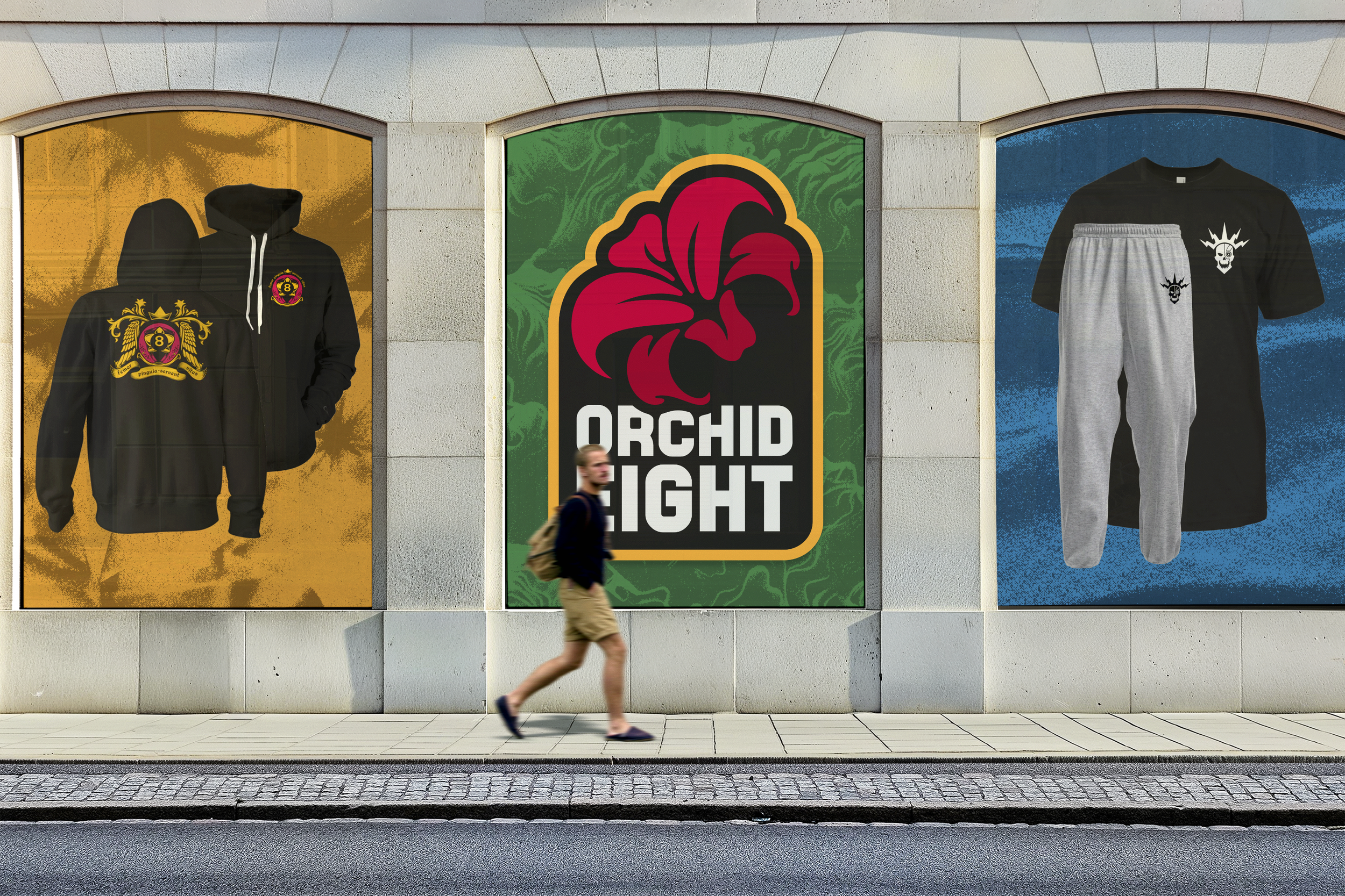
I had the pleasure of working with creator Bricky and his brand Orchid Eight, an apparel company/distributor specifically leaned towards content creators. Their original issue was more just having a not well-received logo with no substance/identity to back it up. So the goal was to update the brand to match their target demographic and match the their enthusiasm and variety without leaning into typical motifs of the industry and pop culture (ie. red vs. blue primary colors, muted natural colors, etc.)

The Result
Together, we “did some gardening” and curated a brand that didn’t step away from it’s original identity and mainly refreshed it in a way that personified and matched the energy Bricky had in his mind. Aside from making sure they had a logo and a branding guide, we visited multiple avenues on how to adapt and make sure their brand can be versatile as their footprint outside apparel.



Logo Development + Final Branding





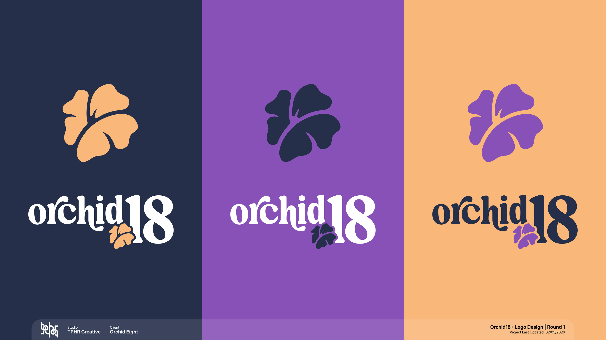
A year and a half later, I was contacted again by their marketing director to come up with branding for a sister company called Orchid 18, a branch within Orchid Eight that deals with mature content creators and NSFW content. We wanted to pay homage for to the retro 70’s font used with a contemporary look and also feature their orchid in a suggested way. What we came up with was a tasteful, subtle design that isn’t too explicit but evokes a “when you see it...” moment.